Simply Music
2019 · UX Research · Competitive Analysis · Interaction Design
Simply Music is a research-driven exploration of music streaming usability. Through competitive analysis and user testing, I identified friction in discovery and playback, then prototyped a more utility-focused listening experience designed around speed and clarity.


The feel of Apple Music, but built for efficiency.

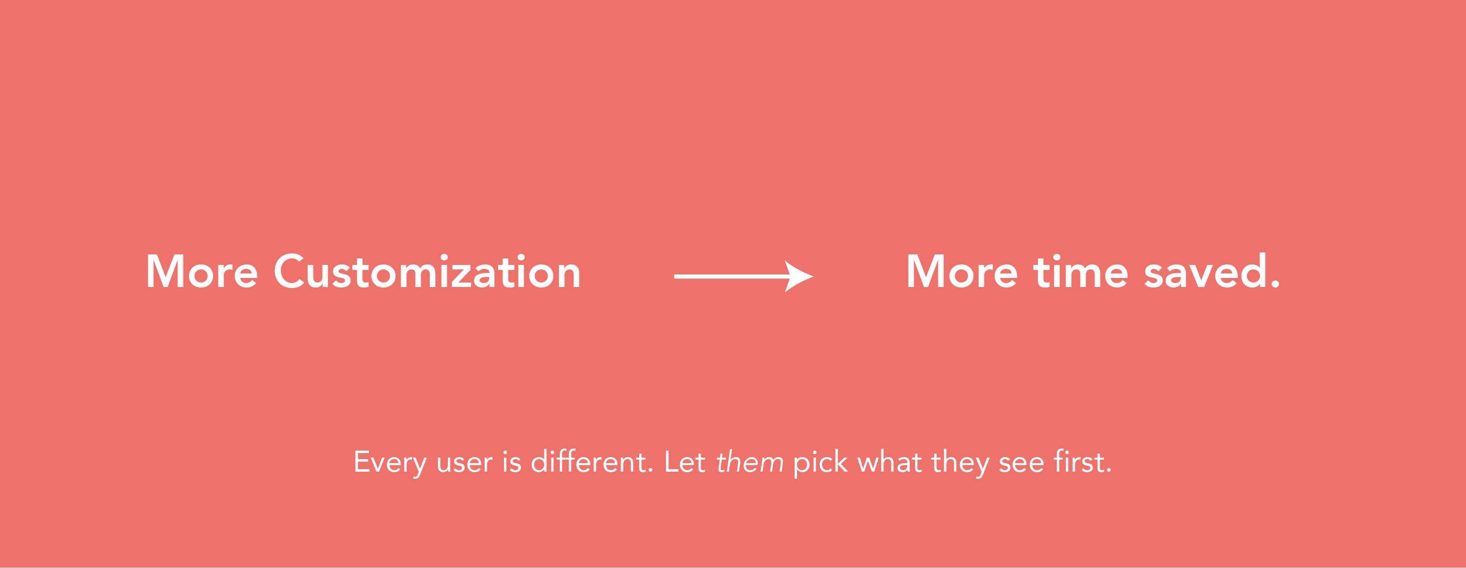
Why fill the most important spaces with useless features?
You decide what’s important.
home screen so they’ll be there
when you need them most.


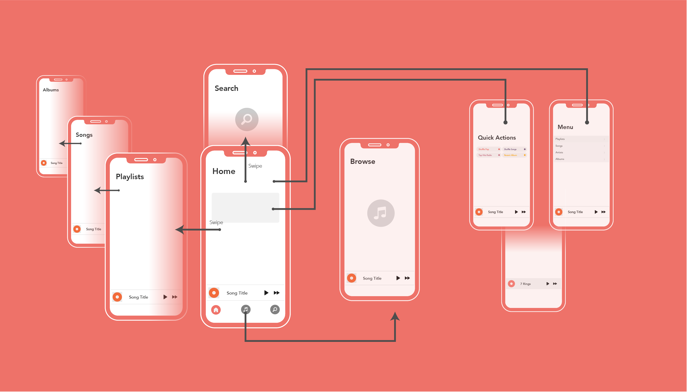
Quick Actions
Play your music with only one click.
almost anything from one click
on the home screen.

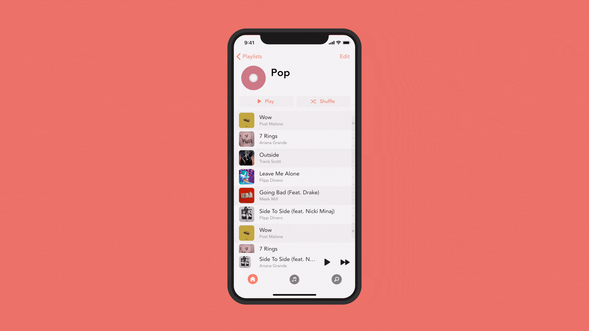
Playing your playlist on shuffle:

Improved Scrolling Everywhere.
scroll though hundreds of songs.

It's your music. Make your playlists your own.
with custom colors and symbols.

UX Process.
What's the problem we’re trying to
solve?
It takes too long to
start playing music.

User Research
First, we needed to find people that have a phone and use it to listen to music somewhat regularly. Then, we explore how most people play their music. – Do they use playlists? Do they play by artists? Do they play on shuffle? Next, we explore pain points. What do users hate most. Finally, we discuss some potential solutions, either from competitor apps or from personal ideas.

Research Insights
1. Most people use playlist to play their music. While this is the most popular, people do still use the other options (such as songs, artists, and albums), so we’re going to let the use change which shows up first.
2. What people like about Apple Music: Pause, skip, and view your music at the bottom of the screen. Scroll down to see your next-up music. Shuffle Button at top of each playlist.
3. What people dislike about Apple Music: No customizability. The home screen is filled with features nobody uses. It takes way too long to scroll through long playlists. Overall poor space usage.
4. Currently, if you add a new song to a playlist, it gets sent to the bottom of the list. Since users want to play their new music most often, that should be the most easily accessible.
The Data.
How fast is SimplyMusic in comparison to others?
First, we need to know how most
people use the app.

Playlists are clearly the most used section.
Now, what do users do from here?

Design Process.
Experiment with potential solutions to every problem.
Important UX Mechanics: (That other apps use)
- Swipe side to side to go to different pages. ie. Switch between library, playlists, browse.
- Put search on home page instead of on the tabs — Saves room and still easily accessible.
- Pull from the top to search for music.
- Swipe right (on home page) to go directly to playlist. (Customizable)
Prototype
Transform ideas and solutions into a usable product.

Beautify
Refine designs to merge beauty and functionality.
Explore different options to create the most elegant solution possible.

Test
How well did our solutions perform in a real world scenario? The data doesn't lie. Give our
prototypes to real users and get feedback on what could be improved.
"I really love how everything is on one page!"
– Participant 4
"The swiping seems to get in the way. I seem to swipe when I don't mean to."
– Participant 11
Tweak
Use our data and feedback further improve and explore other solutions in search for the best
one.
Retest, and don't stop until it’s perfect.

Final Design
Release the product and see how the public reacts. Keep improving as more feedback is received
from
the masses.
The Results.
To test efficency, everything needs to be done as quickly as
possible.